Brand
Media kit.
Writing about girl.dad, partnering with us, or putting the brand on a slide? Everything official lives here: logos, colours, type and ready-made banners. If you need something that is not here, ask us at hey@girl.dad.
Logo & mark
The lockup and the braid
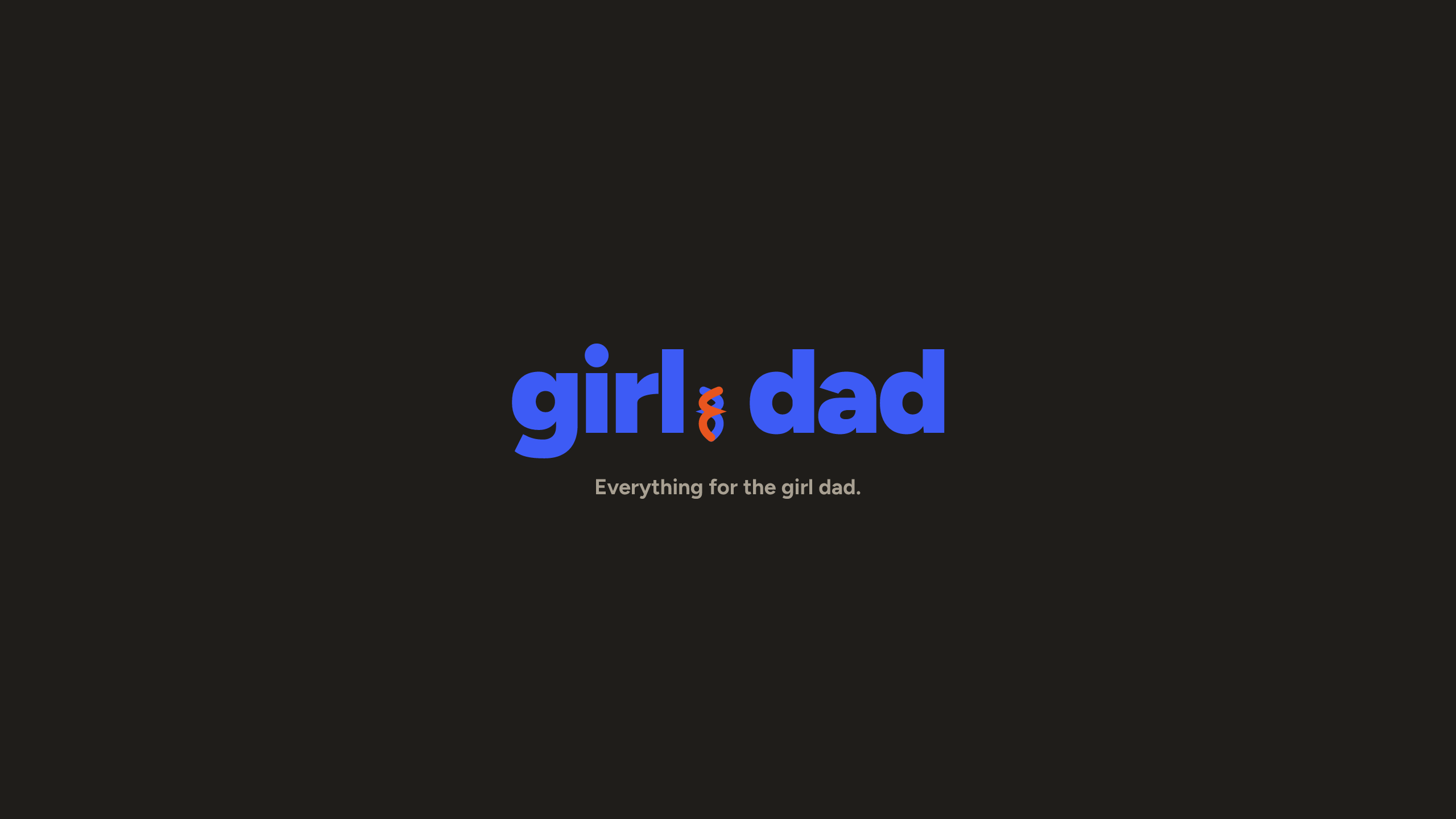
The wordmark is girl and dad joined by a two-strand braid, one ink strand, one orange. The braid is the dot. Use the lockup whole; the braid mark can stand alone at small sizes.





Colour
The palette
Cream and ink do the talking. Blue acts, orange punctuates, green underlines, pastels play.
#EDE8DFPage background#FBF9F4Cards & surfaces#1F1D1AText, borders, dark sections#3D5BF5Primary action#E8551FAccent & full stops#2FBF71Underlines & positives#C9D3F9Pastel tint#F9D3BEPastel tint#E0D0F3Pastel tint#C4E7D2Pastel tintTypography
Figtree, 400 to 900
One family everywhere: Figtree, from Google Fonts. Headlines run heavy (900) with tight letter-spacing; body copy sits at 400 to 500. No second typeface, no exceptions.
Black 900 — headlines & wordmark
ExtraBold 800 — card titles & buttons
Bold 700 — eyebrows & links
Medium 500 — body copy
Social
Banners, ready to upload
Sized for each platform, with the wordmark clear of profile-photo crops and safe zones.

Usage
The short rules
Do
- Use the lockup on cream, off-white or ink backgrounds.
- Keep clear space around the mark of at least the height of the braid.
- Use the braid mark alone when space is under 24px tall.
- Write the name in lowercase: girl.dad, never Girl.Dad or GIRLDAD.
Do not
- Recolour the strands, stretch the mark, or add effects.
- Replace the braid with a full stop, colon or any other glyph.
- Set the wordmark in another typeface.
- Place the lockup on busy photography without a solid panel.
Press and partnerships: hey@girl.dad